One line.
The mark is a single stroke with round ends that rises, arches, drops and climbs again, then a small arc closes it. It is the only logo on the page, so it works without my name beside it.
On paper and white the stroke is the brand blue. The file is called logo-black.svg on the site, but its ink is #2F45FF.
Space and size
Give the mark room and keep it big enough that the arc still reads.
Clear space
At least half the mark’s width on every side. Nothing else enters that box.
Sizes
40 by 41px in the site header. Below 24px use the favicon file, which is padded and drawn heavier.
Two inks
Blue on paper and white. White on the dark band and the blue band. Nothing else.
Please don’t
Every one of these has been tried on somebody’s logo somewhere.
One blue.
Warm grey paper, near-black ink and a single electric blue. Sections change ground instead of adding colors: paper, then the dark band, then the blue band.
The core three
These three carry the brand. Everything below is a tint or a role of one of them.
Supporting colors
Each one has a single job. Most are the core three adjusted for a different ground.
One typeface, every weight.
Inter Tight does everything. Weight carries the hierarchy: 420 for reading, 500 for labels, 780 for headlines, 830 for the poster voice. Headlines run tight, at -0.05em to -0.064em.
ABCDEFGHIJKLMNOPQRSTUVWXYZ abcdefghijklmnopqrstuvwxyz 0123456789 &?!’“”→↓↑↗
Self hosted as one variable file, so every weight between 100 and 900 costs nothing extra. Fallbacks: Helvetica Neue, Helvetica, Arial.
The scale
Sizes are fluid. Each style lists its largest size; it shrinks with the screen down to the clamp’s floor.
One piece of glass.
An inflated, see-through RM floats over the headline. A copy of the words sits inside the lens in blue, magnified and bent, so the type reads through the glass. Move your pointer over it.
Makeyourselfhard toforget
Four layers
Turn a layer off to see what it does. The files live in the site’s assets/glass folder.

glass-shadow.webp, offset 2% right and 5% down.

glass-mask.webp. Cuts the blue copy of the headline to the RM’s shape.

glass-shade.webp. Highlights and edge shading laid on top.
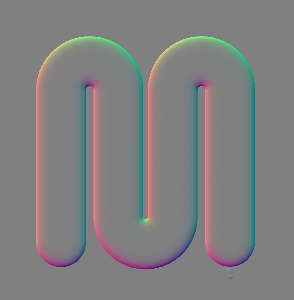
glass-disp.webp. Red and green tell the filter which way to bend each pixel.
Drawn with the same line.
A hundred icons on a 24px grid, in the mark’s own 1.5px stroke with round ends and arched tops. Line is the default. Glass adds the lens behind it, for feature moments on paper.
No icon by that name. Try a plain word like mail, chart or arrow.
Rules, not boxes.
Structure comes from 1px hairlines above labels, rows and lists. There are no cards or tinted panels on the site; only images, video and the pills get round corners.
Pills
The only button. 13px uppercase, 999px radius, arrow nudges 3px. Every hover goes blue.
Section label
Number, name and an aside on a hairline. Opens every section; a big headline always follows.
Chips
- Naming
- Identity
- Brand book
- Website
Labels, not buttons. Outlined, never filled.
Rules
Two weights of line do all the structural work.
Facts
Client
Humans BeingRole
Naming, identity, brand book, websiteCase studies open with label and value rows like these.
Project index, on dark
Names slide 8px and turn the dark band’s blue on hover.
Mail button, on blue
The contact band’s only call to action. The arrow turns 45 degrees on hover and the whole pill inverts.
Quick to settle.
Motion is quiet and physical. Things arrive fast and land softly, lines draw, and only the glass is allowed to move on its own. Reduced motion turns all of it off.
Arrive
ease-out · cubic-bezier(.2,.7,.2,1)Rises, reveals, image zooms. Fast start, long soft landing.
Draw
ease-io · cubic-bezier(.65,0,.35,1)Lines that draw and anything that starts and ends at rest.
Type in motion
Eight treatments, one per view. Only weight, tracking, a mask or a fill moves, so headlines never bounce. Press Replay on any of them.
Readable pairs.
Pick any text color and any ground from the palette and see whether it reads. A few brand pairs miss on purpose; they are decorative and always have a readable version beside them.
Text Ink
Ground Paper
Make yourself hard to forget.
Body copy at 18px. I help brands find their voice, own their look, and give people a reason to care.
Named to be found.
Every image on the site follows one pattern: what it is, which project, a short description, then its width. Lowercase, hyphens, no spaces, no “final”.
- Lowercase letters, numbers and hyphens only
- The project code stays short and never changes
- Export every raster image at all four widths: 640, 1200, 1920, 2500
- Webp for photos and screens, SVG for marks and icons
cover-hb-robot2-1200.webpHumans Being cover, 1200 widecover-lfr-banners-1200.webpLEGOLAND Florida Resort covercc-01-hero-1200.webpCurve + Corner hero, first in its sequenceHumans Being Cover FINAL v2.pngSpaces, capitals, “final”, no width