
Both halves, built together.
Challenge
Going independent meant introducing a studio, not a freelancer. It needed a name and a look that felt senior and personal at the same time, and one simple way to say what makes the work different: brands that look good at launch and hold up after.
Role
I named the studio and built the identity, the voice, and the website, from the first sketch of the mark to the last page of the site.
Approach
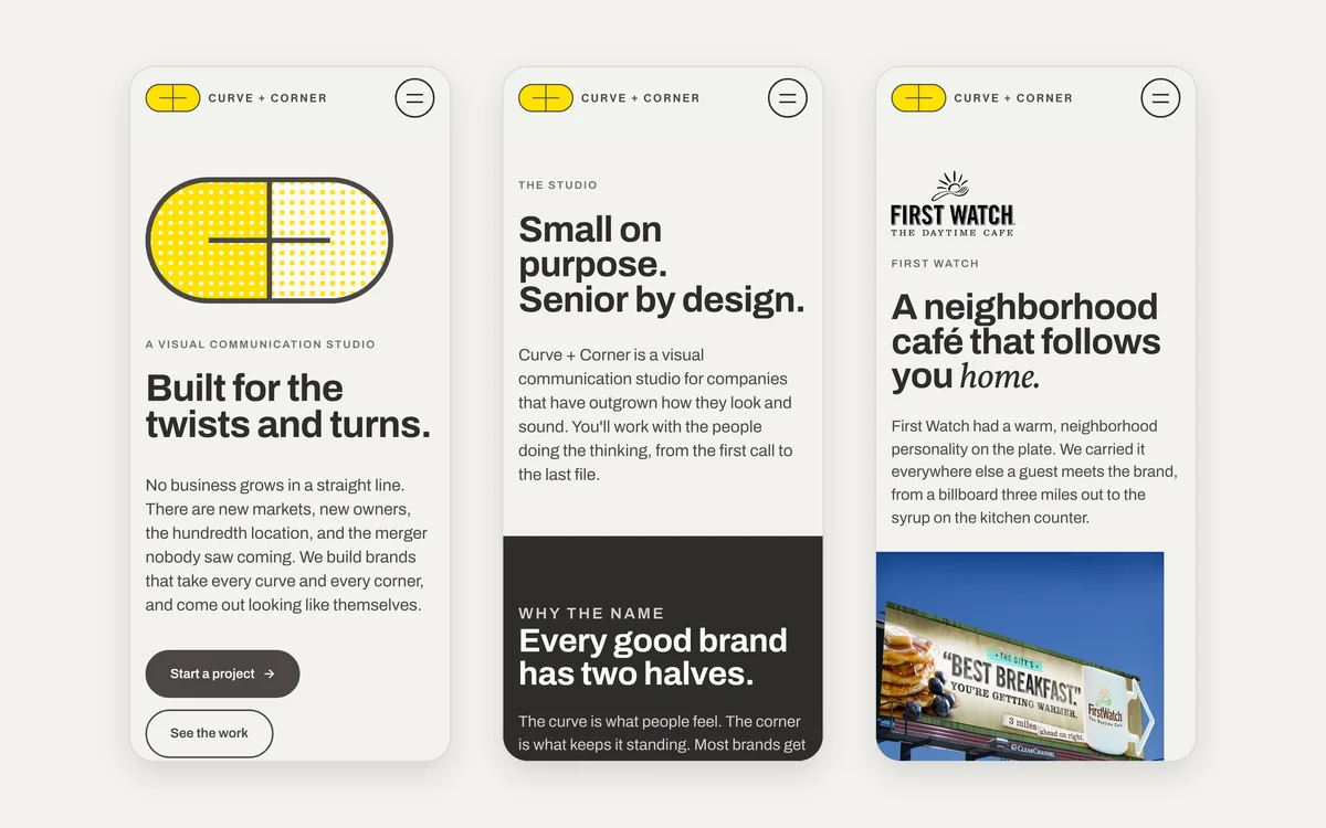
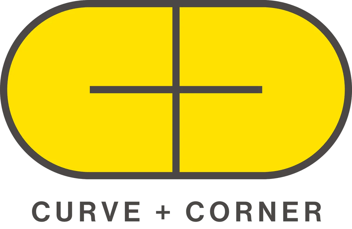
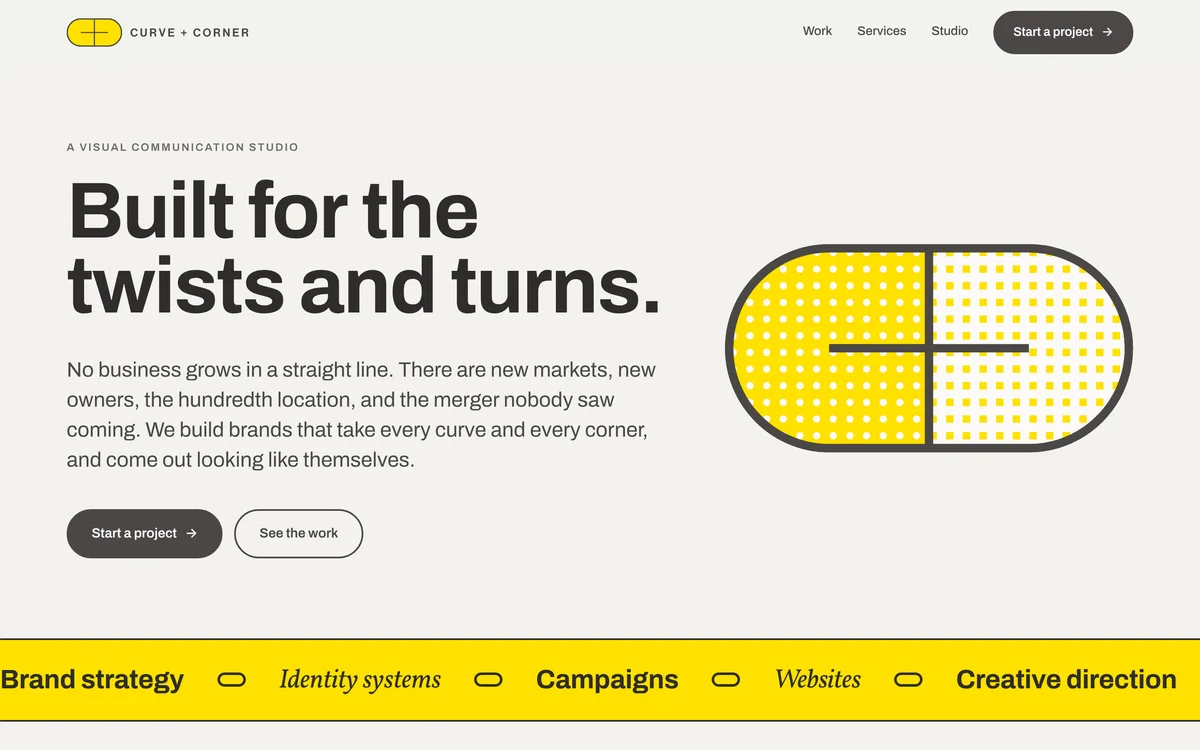
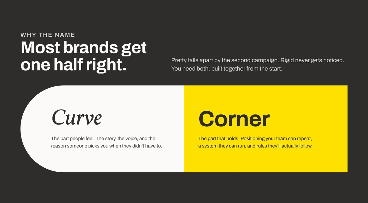
The name is the method. Curve is the part people feel: the story, the voice, and the reason someone picks you. Corner is the part that holds: positioning a team can repeat, a system they can run, and rules they'll actually follow. The mark puts both in one shape, a rounded pill cut by two straight lines that meet at right angles. The type does it too, with Archivo for structure and Vollkorn italic for the words that should feel something.
Outcome
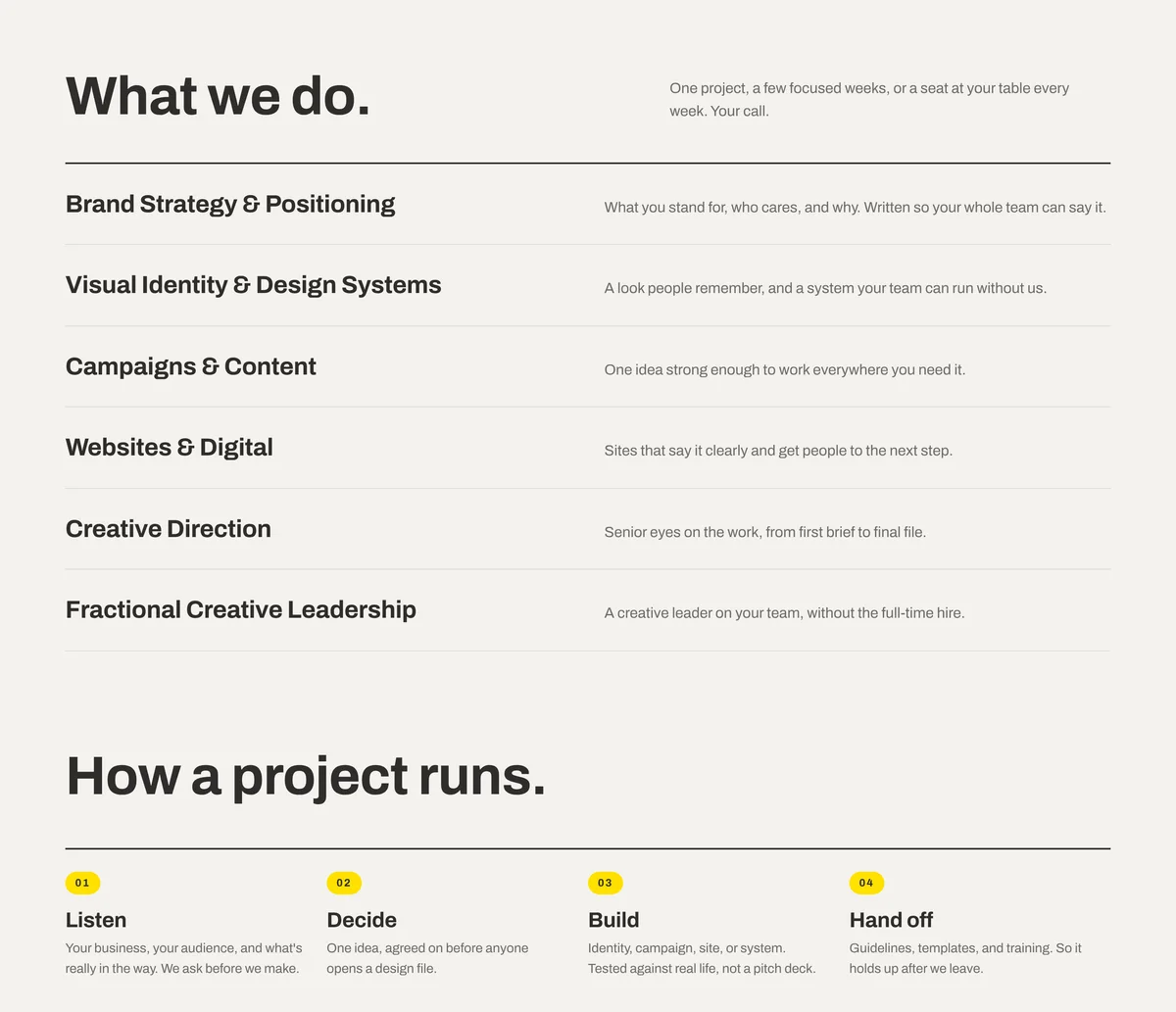
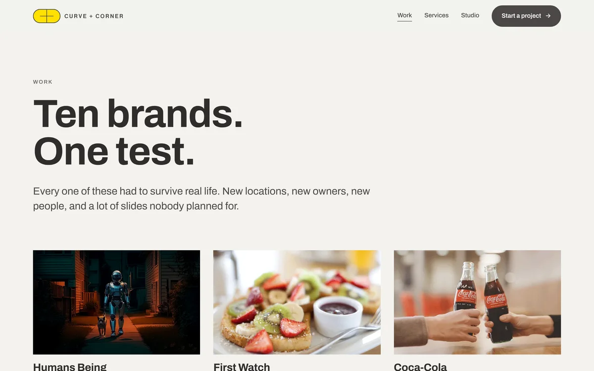
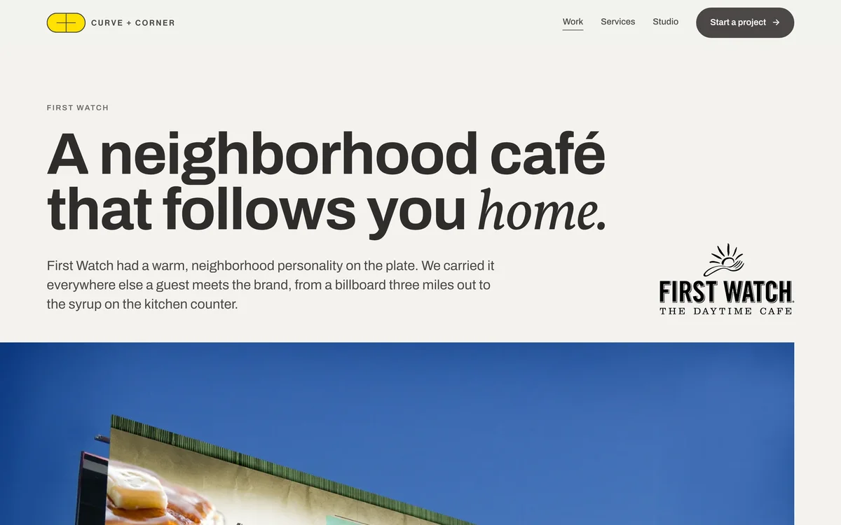
A complete studio brand: a name, a logo suite in stacked, horizontal, and mark versions, a palette and type system, and a website with ten case studies, a services menu, a studio page, and a password-protected brand page for clients.
Why the name
Most brands get one half right. Pretty falls apart by the second campaign. Rigid never gets noticed. Curve + Corner says that in the name, then proves it in everything the studio makes: one half to make people care, one half to keep it standing after the launch.
The site
The website is the studio's first case study. It leads with proof instead of promises: three numbers from real projects, then the work, then the services and how a project runs. Every page speaks in the same two voices, a hard Archivo headline with one soft Vollkorn word where the feeling lives.