
From what you do to how you do it.
Challenge
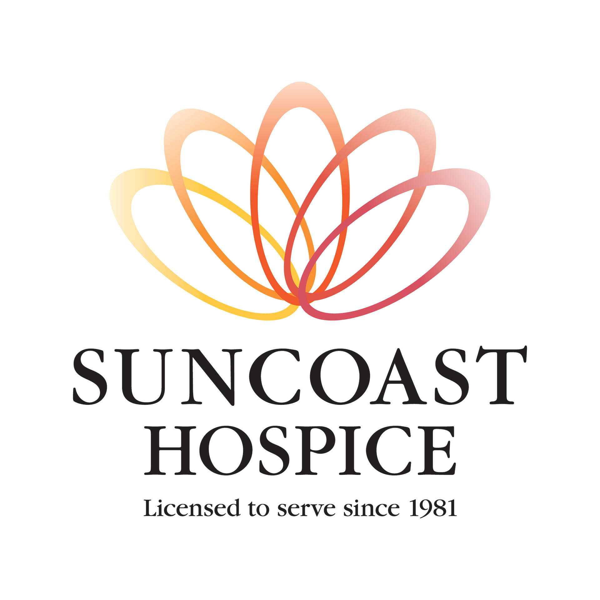
Suncoast Hospice had outgrown its own name. What started as end-of-life care had expanded into palliative care, grief support, and broader wellness programs, but the name still said one thing: hospice, in Pinellas County. That created two real costs. Families and doctors hesitated to reach out because "hospice" reads as a last resort, so referrals came in too late to do much good. And the geography baked into the name made growth outside the county awkward at best.
Suncoast Hospice had outgrown its own name. What started as end-of-life care had expanded into palliative care, grief support, and broader wellness programs, but the name still said one thing: hospice, in Pinellas County. That created two real costs. Families and doctors hesitated to reach out because "hospice" reads as a last resort, so referrals came in too late to do much good. And the geography baked into the name made growth outside the county awkward at best.
Role
Creative Direction, Brand Development
Creative Direction, Brand Development
Approach
Move the brand from naming what the organization does to naming how it does it. This led the work, landing on Empath Health, a name built around the caregiving posture behind every service rather than the service itself.
Move the brand from naming what the organization does to naming how it does it. This led the work, landing on Empath Health, a name built around the caregiving posture behind every service rather than the service itself.

The identity
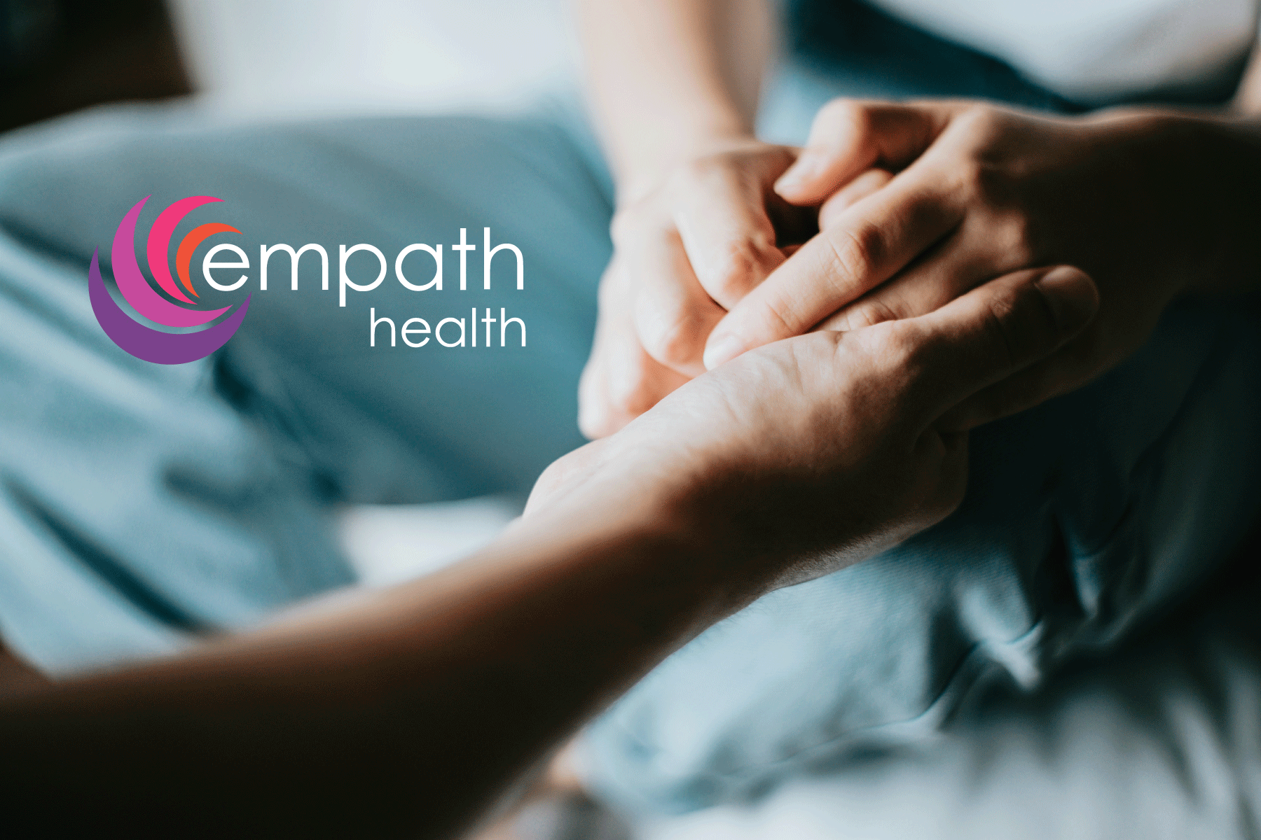
The mark takes its cues from a nautilus shell, and it's a sharper piece of thinking than it first appears. A nautilus grows in chambers, adding a new one at each stage of its life while still living in the newest, outermost one, carrying its full history without ever discarding a piece of it. That's almost exactly Empath Health's own growth story: Suncoast, then the 2021 merger with Stratum, then the more recent integration with Trustbridge, each one folded into a single continuous structure rather than bolted on as a separate brand.
The mark takes its cues from a nautilus shell, and it's a sharper piece of thinking than it first appears. A nautilus grows in chambers, adding a new one at each stage of its life while still living in the newest, outermost one, carrying its full history without ever discarding a piece of it. That's almost exactly Empath Health's own growth story: Suncoast, then the 2021 merger with Stratum, then the more recent integration with Trustbridge, each one folded into a single continuous structure rather than bolted on as a separate brand.
The nautilus is also one of nature's clearest examples of a spiral, a shape long associated with organic, effortless growth rather than growth that's forced. For a health system, that's a subtle signal that care expands alongside a person's life instead of imposing itself on it. And a shell is, at its core, a protective structure built around something soft and vulnerable, about as direct a metaphor as you could ask for from an organization rooted in hospice care.
The color palette runs purple at the outer edge into pink, magenta, and orange at the center, cooler and steadier on the outside, warmer and more alive as it moves in. It reads as approachable without being loud. The wordmark, by contrast, stays completely quiet: flat purple, lowercase, no effects. That restraint matters. The mark gets to carry the emotion because the type isn't competing for attention, and the lowercase letterforms read more like a name you'd say out loud than an org chart entry.
Proof it worked
The current site leads with hospice folded into a list of twelve service lines, from home health to grief services to HIV and sexual wellness, none of them awkward under this name. And the homepage is currently headlining the completed integration with Trustbridge, now Florida's largest non-profit hospice network. That's a third organization absorbed under the same name, years after the original rebrand, proof this wasn't a one-time fix but a structure built to keep holding new additions.]
The current site leads with hospice folded into a list of twelve service lines, from home health to grief services to HIV and sexual wellness, none of them awkward under this name. And the homepage is currently headlining the completed integration with Trustbridge, now Florida's largest non-profit hospice network. That's a third organization absorbed under the same name, years after the original rebrand, proof this wasn't a one-time fix but a structure built to keep holding new additions.]
Outcome
A name built on function has a shelf life. It expires the moment the offering changes. A name built on disposition keeps working as the organization grows. Empath Health gave up the specificity of "hospice" for the durability of "empathy," and the identity system, right down to the shell it's built around, was designed to hold onto everything the brand became along the way.
A name built on function has a shelf life. It expires the moment the offering changes. A name built on disposition keeps working as the organization grows. Empath Health gave up the specificity of "hospice" for the durability of "empathy," and the identity system, right down to the shell it's built around, was designed to hold onto everything the brand became along the way.